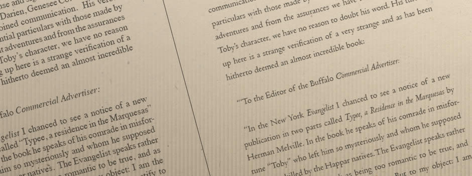
 Book typesetting flourished as a craft during the days of hot metal type. Today’s digital processes make it easy to flow and organize text but without careful study of traditional typography, the results achieved will rarely match a level of quality, readability and comfort that was once commonplace. Moreover, the demands of mass production compel publishers to cram tiny text into pages with narrow margins.
I offer paragraph-by-paragraph, sentence-by-sentence book typography for authors and publishers who care about quality. Using print-on-demand production methods instead of volume production, it is possible to produce an elegant book at negligible additional cost.
Read my articles about book typography.
Book Design Basics Part 1: Margins and Leading
Book Design Basics Part 2: Optical Margins, Indents and Periods
Book Design Basics Part 3: Running The Numbers
Book Design Basics Part 4: Dashes, Hyphens and Dots
Book Design Basics Part 5: Small Capitals – Avoiding Capital Offenses
How Many Spaces After a Period? Ending the Debate


